Table of Contents
In this article, we shall simplify Color Formation to help us in understanding Additive vs Subtractive Color. The basic color wheel is simply based on light and dark. Which is represented by combinations of red, green, and blue.

READ ALSO: How to use selective color adjustment layer in photoshop
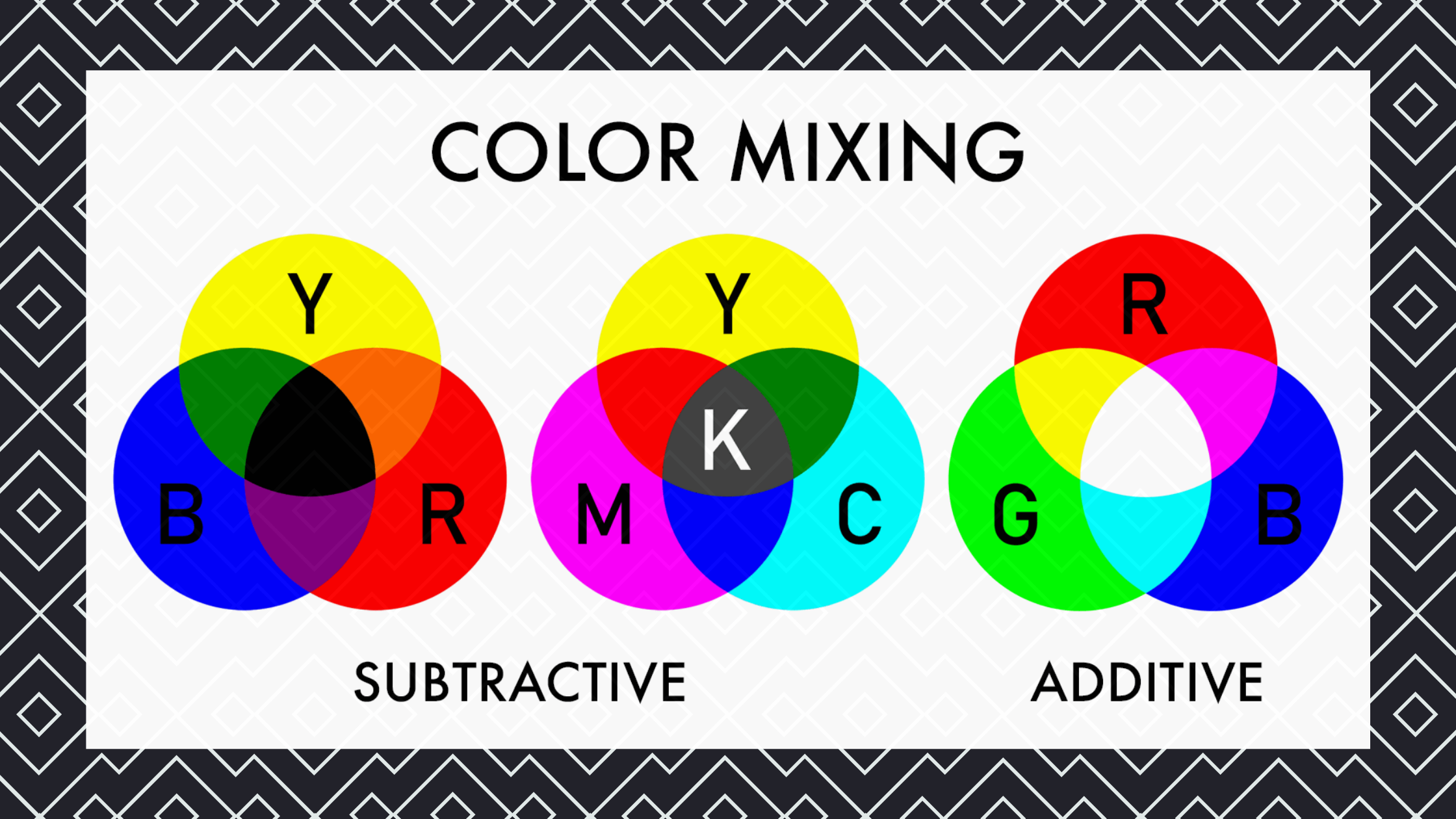
An Additive color is the result of light mixing with any other colors in the same spectrum (red + orange = yellow). A Subtractive color is the result of light passing through a transparent medium like glass or water (yellow + blue = turquoise). The most common examples are red, green, and blue; each one has an additive version with which you can mix to create new colors.
You can imagine that white is created when equal amounts of all three colors are mixed together. Red, green, and blue are called primary colors because each can be created by mixing two others. For instance, red is a combination of the primary colors yellow and magenta. Other examples of primary colors include yellow (red + green), cyan (blue + green), and magenta (red + blue). In contrast to the three primary colors. There’s a whole range of possible combined colors that can be created from these two – orange from mixing yellow and red, or purple from mixing red and blue.
Additive Color
The Additive color is where light is added together to create a new color. Additive color uses light sources – light bulbs, computer monitors, projectors, etc. Subtractive colors are the opposite of additive colors. These are colors created when you mix them together. Subtractive color uses transparent materials, like ink mixing with water in paint, or colored pencil pigments on paper.
A popular example of subtractive color is the mixing of paints to create new colors. Any home improvement store will offer dozens of different shades of paint. That can be mixed together to create almost any color imaginable. That’s the best way to think of subtractive color – mixing things together. And the most common way to create all of the millions of possible colors.
Tertiary Colors
There is also a tertiary color, which is a combination of a primary color and a secondary color. For instance, red is a secondary color because orange can be created from mixing red and yellow. Or yellow is a tertiary color because it’s created from mixing red with green. Another example of tertiary colors are blue-violet, which combines blue and violet to create purple-magenta. The tertiary color is usually created by combining three primary colors.
Additive Tertiary Colors
There’s also an additive tertiary, where you mix two secondary colors together to create another secondary color. Again, this is different than the tertiary color because it’s created by mixing two other secondary colors together. Another important thing to remember about additive color is that it can’t be created by mixing yellow with magenta. Because yellow has no red, only green and blue components. It can also be created using cyan because blue has no red component, only green and magenta components. Tertiary colors are the same way – they can’t be mixed with any other colors in their groups because none of the other secondary colors have all three primary components. Tertiary colors only work with the primary and secondary colors that contain all three primary color components.
Subtractive Color
Subtractive color is created by taking light and passing it through a transparent medium like paint, water, or glass. Once the light is filtered through the transparent material, each of the three primary colors interacts with the material to absorb certain frequencies. If you think about a lamp shining through a red object, for example, it would appear red because all wavelengths of light are absorbed except for red.
Subtraction is also used when passing white light through filters or pigments on paper or paints on canvas to create different colored inks for printing. This all works because yellow absorbs blue, absorbing nearly every wavelength of light except for yellow. Yellow is the same way as red but absorbs nearly every wavelength of light except for green.
It is very important to concentrate thoroughly on understanding additive vs subtractive colors. To help your graphic impute in extension to photographic images.
When you look at a pair of complementary colors, one should appear to be dark while the other appears to be light.
CHECK OUT ALSO: How to configure Photoshop Color settings
Color Schemes
Complementary Colors
Complementary colors are first-opposite pairs on the color wheel. For example, red and green are complementary colors because blue is an opposite color that appears lighter to them both. Another example would be yellow and violet because they’re opposites to each other on the color wheel, but yellow appears darker than violet. Color schemes are used frequently in graphic design, fashion design, painting, interior design, etc., helping artists create compositions that are pleasing to our eyes.
A color can be complementary to itself. For example, yellow and red are complementary colors to each other.
In contrast, color can’t be both complimentary and opposite of itself because it would cancel out on both sides and not appear as a color at all. For example, red and violet are not the colors that we see because they cancel each other out.
Complementary colors can also be seen as analogous or analogous to each other – related by shape or form. Or you could say that they’re similar in some way such as belonging to the same group of colors on the color wheel such as orange-red or green-blue.
Analogous Colors
Analogous colors are next-door neighbors on the color wheel. For example, blue-green and green are analogous colors because they’re neighbors on the color wheel. You could also look at them as related colors. They’re not quite the same, but they’re close enough to be used together in a project. Like painting a room of your home or designing your website’s color scheme.
When looking at an analogous color scheme, both colors should appear to be of similar value. They shouldn’t appear too dark or too bright together. For example, if you look at red and yellow you can see that they’re similar shades of orange – they share complementary hues that appear darker than both yellow and red alone.
The color wheel below shows the six types.
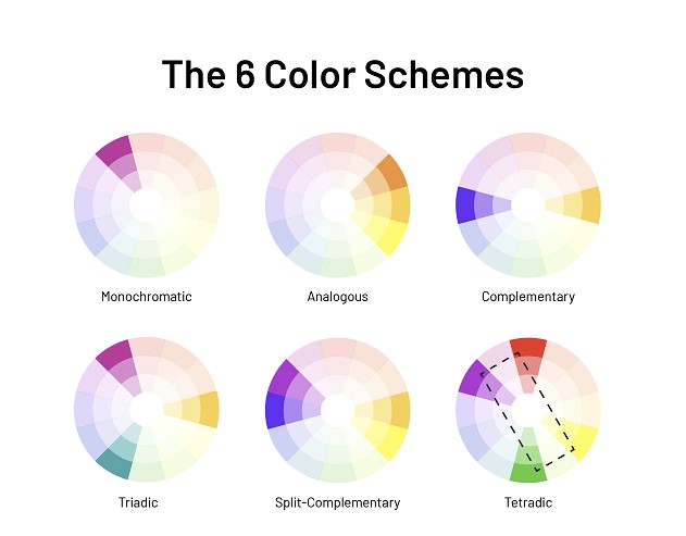
The color wheel shows the relationships between all of the colors. Complementary colors are opposite each other, so red is opposite green, and yellow is opposite violet. Colors directly across from each other are called “sister” colors, so blue and red are sister colors. Because they’re directly across from each other on the color wheel. To create an analogous scheme, you’ll use hues that are next door to one another. For example, blue-violet and violet-blue are analogous colors because they’re next-door neighbors on the color wheel. Analogous colors should appear similar in value, tone, and saturation and you can use them together for a pleasant composition.
“Analogous” is an old word with a new meaning.
These Analogous colors are those that are next-door neighbors on the color wheel. For example, blue is next door to purple. Colour harmonies such as blue with purple or yellow with red can be created as analogous. As long as they appeal to our eyes as pleasing to the eye. When you pick a color from the color wheel to use, don’t just choose any blue or purple. You want to choose one that’s next-door neighbor to the other color so they appear similar in value and tone.
Creating a Balanced Scheme
There are many other color schemes, but knowing about complementary, analogous, and triadic relationships is a good start.
To create a balanced scheme, use a combination of both complementary and analogous colors. The dominant color is the one with the most intensity of value (lightness or darkness) at its center (hue). The complement (neighbor) is on the opposite side of the color circle on the outside edge; they act as part of the same thing but are not identical objects.
For example, if you were using blue and yellow, blue would be the dominant color because it is the strongest. If you wanted to create a triadic scheme of complementary hues within a larger scheme of analogous hues, blue-violet and violet-blue would be the colors that complement each other.
There are many things that can go wrong when choosing color combinations that aren’t balanced for various reasons. For example, some websites use an analogous scheme for their design but use tints of colors in some areas to create tiny bits of contrast between elements onscreen. This isn’t a properly balanced scheme, but it helps visual elements be clearer and more functional. Another example is a website whose only use of complementary colors is for its logo. In this case, one could argue that complementary colors aren’t used consistently throughout the site to create an extended color palette.
In order to get a good balance of color. You can choose schemes with tints, tones, and shades of each hue. Make sure the tints are similar in value (lightness) to the dominant hue or hues in your scheme. Ascertain that they are created using equal amounts of white and the hue (tinting).
For example, if you were using yellow and its dominant hue is yellow-orange (tinting). You’d add white to the hue (yellow) in an equal amount to the amount of yellow (hue) you used. When selecting a tone, make sure its value is similar to that of your dominant hue. Finally, when selecting a shade, make sure its value is similar to that of your dominant tint.
When working with a balanced color scheme. Choose the main color that’s closest to true or pure white, and then select a shade that’s closest to true black. This combination creates the most contrast which makes an area appear more visually active and commands the attention of viewers.
Use tints, tones, or shades of each hue in your color scheme to create visual unity. A good rule of thumb is that the tints, tones, and shades of each hue should appear evenly distributed throughout the site to be visually cohesive throughout. That doesn’t mean every single item on the site has to be created with tints, tones, or shades of each hue. It just means that your selection of color is consistent throughout. Inconsistent use may lead viewers to believe things are “wrong” with the design. A good example of inconsistent use of color is using yellow for most elements but using yellow-orange (tinting) for some areas like headlines. If you were to use tints, tones, or shades of each hue throughout the scheme, they would appear evenly distributed.
Choose a dominant hue and create tints, tones, and shades of that dominant hue for your scheme. The tints are created using equal amounts of white added to the dominant hue. The tones are created by adding gray to the hues (colors) one step at a time. Until you reach full saturation (intensity). For example, if you were using red as the dominant hue, starting with red-violet (coloring) you’d gradually add gray until it becomes red-orange (coloring).
Choose a dominant hue and create tints, tones, and shades of that dominant hue for your scheme. The tints are created using equal amounts of white added to the dominant hue. The tones are created by adding gray to the hues (colors) one step at a time until you reach full saturation (intensity). For example, if you were using red as the dominant hue, starting with red-violet (coloring) you’d gradually add gray until it becomes red-orange (coloring).
Harmonious Scheme
A mix of complementary colors with analogous colors creates a harmonious color scheme.
A bad example of a harmonious scheme would be to use yellow and orange on the site with one shade of yellow on top of another. For emphasis or some text within the scheme. This choice of color scheme maintains visual unity but breaks down the color palette into too many pieces.
A good example of a harmonious scheme would be to choose two similar shades of yellow with equal amounts. Color harmony is created when you mix complementary colors together in equal amounts. If you had chosen two shades of blue (violet-blue and blue-green), you would get neutral (grey) more often than not (see below).
Harmonious schemes are great for people who want to create a sense of unity throughout their site, but they are more of a palette decision than an actual design decision. As with all color choices, there is no one-size-fits-all way of structuring your scheme. It is important that you chose the dominant hue that you think looks best and choose complementary colors to be used in equal amounts.
Monochromatic Scheme
One reason you’d choose a monochromatic scheme would be if you wanted to go for a more conservative look or one that is more serious, formal, or elegant. Monochromatic schemes are best used when the site’s function and/or audience is aimed at conservative people (that could mean it’s for business, politicians, health care institutions, etc.) that need to appeal to the masses. These schemes aren’t as flashy as other color schemes and sometimes can appear too bland or boring because of this. This type of scheme is also very easy to create because you use the exact same color (hue) throughout your scheme.
One reason you’d choose a monochromatic scheme would be if you wanted to go for a more conservative look or one that is more serious, formal, or elegant. Monochromatic schemes are best used when the site’s function and/or audience is aimed at conservative people (that could mean it’s for business, politicians, health care institutions, etc.) that need to appeal to the masses. These schemes aren’t as flashy as other color schemes and sometimes can appear too bland or boring because of this. This type of scheme is also very easy to create because you use the exact same color (hue) throughout your scheme.