Table of Contents
You need to pay attention to this awesome article on how to configure Photoshop color settings. There are many options for use of colors in Photoshop and we will go through the most important of them. They all have both advantages and disadvantages, Which you might want to take into consideration before setting up your new work environment.

READ ALSO: How to remove freckles in photoshop
RGB mode: RGB stands for red, green, and blue. These are the three primary colors that can be used in an image. RGB is a good choice if you know what color balance you’re after. Because pixel values can be converted to RGB values and vice versa.
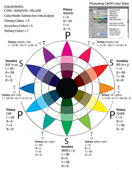
CMYK mode: CMYK is the abbreviation for cyan, magenta, yellow and black. These are the four colors used in commercial printing. CMYK is a good choice if you want to adjust the color balance. And then print your image as a poster or an ad.
Indexed: Indexed mode results in images with 256 colors – this is fine for simple drawings, but not suitable if you intend to do more advanced work.
Grayscale: Grayscale mode produces 256 shades of gray – it’s a good choice if you want to experiment with black and white photographs or movies. If you use this mode, you will have to create your own version of ‘black tones’.
Duotone: A duotone is when you have two colors in your image. Duotones are often used in posters or when printing business cards.
Separation mode: Separation mode allows you to have CMYK, grayscale, or duotone. Without any limits on the number of colors in your image. A good choice if you want to print a poster or something similar with several different color schemes in one print.
Match Print: This option makes minor adjustments in the image. So that it looks just like the original print used for comparison. No matter how many changes have been made to the image since then. This option is only available in CMYK mode.
Question:
what is the relation between RGB and CMYK? how to convert RGB image to CMYK image? How come an RGB image will only have 256 colors but a CMYK image will have millions of colors? What is indexed color and grayscale & duotone & separation mode?
Answer:..how to convert RGB image to CMYK image.
Color modes are a way of dealing with different colors or shades of colors. The problem with color modes is that you don’t want every program. Every piece of hardware and every user interface uses different ways of dealing with colors. This would be an administrative nightmare.
So, instead of each application using its own method. There are standard modes laid down in the Adobe Color Matrix. This way, all the programs use the same color modes. You can switch between color modes easily and expect to see similar colors in all applications.
What’s an RGB image?
When you create an image in Photoshop, you can choose what mode to use for this image – RGB or CMYK. RGB stands for Red Green Blue and CMYK stands for Cyan Magenta Yellow Black. So what’s the difference?
RGB is for images that will be printed or displayed on computer monitors (i.e., not printed on paper).
CMYK is for images that will be printed.
The difference between images that are intended for display on computer monitors versus. Those intended to be printed on paper are more than just the number of colors available to the image.
RGB has more colors than CMYK, but some of those colors are difficult or impossible to print on paper.
CMYK has fewer colors than RGB. But all of these colors can be printed using a combination of cyan, magenta, yellow and black ink on white paper. This is why you can’t create an RGB image with millions of different colors. But you can create a CMYK image with millions of different colors.
Here’s a simple exercise that will give you an idea of the difference between RGB and CMYK images.
First, I created a simple RGB image with 256 colors in it.
RGB Image
Then I converted it to CMYK using Photoshop’s built-in Color…Convert to Profile…CMYK function. You can perform this conversion outside of Photoshop. By using the Image>Mode>CMYK command. But the results will be the same either way.
As you can see, there are about three dozen different colors in the RGB image. That are completely gone when I convert it to CMYK.
The biggest difference between RGB and CMYK is that RGB (which stands for Red Green Blue) has millions of different colors. But all of those colors can’t be printed on paper. CMYK (which stands for Cyan Magenta Yellow Black) has only a few hundred different colors. But all of those colors can be printed on paper.
CHECK OUT ALSO: How to add freckles in Photoshop
How do you convert one color mode to another?
Let’s say you have an RGB image and you want to convert it to CMYK. So that it can be printed on a color printer. This is a simple task within Photoshop. You just go to Image>Mode>CMYK and a window will pop up asking you if you want to use the Adobe Color Matrix.
When you choose the Adobe Color Matrix. A conversion is made between RGB and CMYK. Because the limited number of colors in RGB doesn’t match the limited number of colors in CMYK. Some colors must be converted into something that can be printed on paper.
In this case, all the reds become magentas, all the greens become cyans, and all the blues become yellow. The other colors from RGB simply get ignored during the conversion process because they’re not valid in CMYK format.
The end result is a CMYK image that looks exactly like it did when it was created. And can be fine-tuned to match the original color tint.
How come an RGB image will only have 256 colors but a CMYK image will have millions of colors?
In both RGB and CMYK images, each pixel can have one of 256 different colors. According to the example above, the red pixel is either red or green. In this case, it’s red because it’s brighter than the average green pixel. The same goes for blue pixels. Which are either completely white or black or somewhere in between depending on how bright they are against their neighbors. Likewise, the green pixel is either completely white or completely black.
While this is true, it’s important to remember that 256 colors are not enough to represent all the colors of real life. The human eye can see millions of different colors on a sunny day, and you can’t just squeeze all those colors into 256.
So there’s no reason why RGB should have more colors than CMYK. It just happens that RGB has more because it was designed for viewing on monitors versus printing on paper.
TIP: Adobe recommends using CMYK to print only images that use fewer than two million colors. To figure out how many colors your image contains, take the number of pixels in your image and divide by 16 (256). This number will tell you how many colors your image uses.
If you’ve created an RGB image. It will use fewer than two million colors since all the colors are in the Red Green Blue portion of the palette. If you’ve created a CMYK image. It’s using more than two million colors. Since all the colors are in the Cyan Magenta Yellow Black portion of the palette.
What is a Grayscale and a Duotone?
Grayscale and duotone are different ways of converting color images to black-and-white. Each has some benefits and drawbacks compared to one another. So it’s important to understand them before choosing which method to use on a particular project.
Grayscale
Grayscale is the simplest way to convert an RGB image into black-and-white. It’s also the most popular of the black-and-white conversion methods because it’s often faster than converting an image to CMYK. To convert an RGB/color image into black-and-white, simply Go To Image>Mode>Grayscale (press Ctrl+Shift+U on Windows or Command+Shift+U on Mac). The Grayscale dialog box appears, which has three options:
White is 100% Black is 0%
You’ll see your original RGB/color image in the preview area at the left. It shows all the colors from your image in their full-color glory. However, you’re seeing them in black and white.
On the right, a preview of a previously grayscale image shows the colors in black and white. You can tell that it’s black-and-white instead of having a tone of gray between each color. They’re all the same shade of gray. In an RGB/color image, there’s no such thing as pure black or pure white. Every pixel is mixed with its nearest neighbor to create shades of grey from dark to light.
You can change the size of the preview area (naturally, it’s big by default) by going to Image>Zoom. You can also zoom using the keyboard shortcuts Ctrl+”-” on Windows or Command+”-” on Mac.
TIP: If you want a black-and-white image that looks a little more realistic. Then a simple grayscale image, try a duotone instead.
Duotone
In Photoshop, a duotone is essentially the same thing as a grayscale image except. That it uses two different tones of gray instead of just one. In fact, many people pronounce duotone “gray tone,” but I digress.
Duotone images have all the advantages of a grayscale image, but they have a few more. A duotone image can include transparency, so you can see through the pixels to what’s behind them. This is useful in many ways. But the most common one is that you can add a drop shadow to a duotone image. That can give it depth and realism.
Duotones also have nice metallic accents that make them look more like photographs than grayscale images do.
To convert an RGB/color image into duotone, go to Image>Mode>Duotone (EDIT>Duotone on Mac). The Duotone Conversion Options dialog box appears (shown at left) which has three options:
Black is 100% Cyan is 0%
Allow Colors to be Printed shows the original color image. With any color pixels converted into black and white. This is the most common duotone option. You can also choose to convert the image to black-and-white only by choosing None.
shows the original color image with any color pixels converted into black and white. This is the most common duotone option. You can also choose to convert the image to black-and-white only by choosing None. Allow Transparencies shows a preview of your image with any transparent pixels shown as their full-color version. While this option won’t appear unless you check it. It’s available so you can see how it will look before making the change.
shows a preview of your image with any transparent pixels shown as their full-color version. Meanwhile, this option won’t appear unless you check it. It’s available so you can see how it will look before making the change. Allow Separation when choosing Allow Colors to be Printed or None. Or when you want to add a drop shadow.
NOTE: Both the duotone and grayscale options use the same dialog box to increase. Or decrease the amount of gray in your image. For both methods, white pixels are 100% black pixels are 0%. However, that doesn’t mean that there isn’t confusion between the two methods. If you’re unsure, just check your image for contrast.
DISTINCTION BETWEEN A GRAYSCALE AND A DUOTONE
A duotone is distinct from a grayscale because it has more than one shade of gray between each color.
When you’re done, click OK. And your image is converted into duotone. A dialog box (shown at right) appears that tells you what’s going on. And if you want to cancel the conversion, click Cancel. If not, click OK and your image is converted into duotone.
Which should I use?
There’s no one right answer here. Grayscale is the simplest way to convert a color image into a black-and-white image. But I recommend starting with a duotone if you’re looking for more realism. Duotones provide great metallic accents. And can be modified with transparency effects. While grayscales are duller and more limited. In some cases, you may even find that an RGB or CMYK conversion would work better than a duotone conversion. Because the different tones of gray can give your image more realism, especially when used with transparency effects.
Choosing between grayscale and a duotone depends on what you need your image for. If you’re a photographer or a graphic designer. A grayscale or duotone is probably the simplest way to convert from color to black-and-white. However, if you’re going for realism and select an RGB/CMYK conversion that includes transparency effects. You may need something more sophisticated.
I recommend that as soon as you begin designing your project, test your images with both grayscale and duotone options. As you learn the process of converting color images into black-and-white or vice versa. Figure out what method works best for each situation. As with anything, practice makes perfect!
2 thoughts on “How to configure Photoshop Color settings”