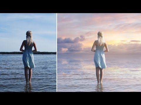
Tired of the same old blue sky in your photos? In this article, you will learn how to change a sky color in Photoshop. These colors will set your photos apart from the crowd.

READ ALSO: How to remove overexposure spot on the face in Photoshop
- Cool Blue Sky: Add a little bit of purple to the blue to get that cool, wispy look. Increase saturation for daytime shots when it is clear, or lower saturation when it is overcast or stormy out. A good rule of thumb for best results is to use high-intensity light magnitudes (i.e., bright days) with low hue saturation. And low intensity (i.e., overcast days) with high hue saturation.
- Warm Blue Sky: Add a little bit of orange (reds and yellows) to the blue to get that nice. Warm sunset look. This works great on clear days, or when you want to make your sky look like it is looming over the landscape.
- Stormy Blue Sky: This is where I like to play around and get creative (cha-ching!). Add a little bit of yellow and white for clouds and storms (on overcast days). The effect isn’t as pure as one would think – it looks more like a hazy blue – but we’ll still take it!
- Bright Blue Sky: Add a little bit of yellow and none at all for a bright, burning sun. On overcast days, use a low-intensity light spot to simulate a bright sun – but watch out – it doesn’t do the blue sky any favors.
- Off-Blue Sky: Use a low-intensity light spot or gradient for this one. For those cloudy days, don’t forget those gray skies!
- Green Sky: You can get that cool wispy look by increasing saturation and decreasing intensity (on clear days). And on overcast days, use a low-intensity light spot to simulate a green sky.
- Yellow Sky: Add a little bit of purple to the blue to get that nice, warm sunset look. On clear days, use high-intensity light spots with low intensity (reds and yellows). As you’d like the sky to turn out on those cloudy days.
- Orange Sky: For some deep orange color – add a bit of yellow and none at all. On overcast or stormy days. Just like we did for the orange sky we just created above.
- Pale Green Sky: This is where you can really get creative. I use this for overcast days by using a gradient of C1 to C6. With two or three rows of each color intensity. You can also create a bright day by using high-intensity spots. With the same gradient as the pale green sky. But use high brightness instead of low to simulate a bright day.
- Dark Blue Sky: Want a night sky without stars? Add a bit of yellow and purple and a dark blue to your blue skies on clear days. And add a low-intensity light spot to simulate an even darker night sky on overcast or stormy days!
- Stars!: If you want to add stars to your night sky, just use a gradient of #000008, #000008, #000001. And then draw the stars by hand over that gradient.
- Blur: This is a trick to try if you want to get that “soft” feel to your sky. Add a blur of 0.6 to 0.9 and use a soft brush to erase your sky’s hard edges so it looks like you were standing there at sunset and looking up!
- Layer Blending Modes: For best results, this works well on clear days when the sun is low in the sky (for evening shots). Or high in the sky (for daytime shots). With this effect, use layer blending modes set to Screen for warm colors, or Multiply for cold colors, with low opacity for morning or nighttime shots, or high opacity for daytime shots.
- Blending Modes: This works best for those times when the sun is low in the sky. And you want to bring out the colors of a landscape that might be a little too subtle. Use a blending mode of Color for warm colors, Normal for cool colors, and Overlay for desaturated colors.
- Gradient Colors: We can’t forget our old friend gradient colors! For those clear days, just use an opacity of 70%. With your gradient color to simulate that “soft” night time sky effect!
- Sepia: Yeah, I know – I just brought up sepia before this section. But it was so integral to my photos that I had to remember it at least once. The technique for sepia for the sky is the same as the technique for sepia in general, so have fun!
- Other Effects: Pick up “Designs & Patterns” by Barbara V.. She’s got some great patterns/grunge effects that can do wonders with your sky – especially from a distance.
- Layer masking: Use a layer mask to erase your sky instead of increasing or decreasing saturation or brightness at all. This works best on clear days, but even if you use a smudge tool to blur out your edges. It looks more natural than using a gradient at all!
- Painting: You can skip this section if you want to. But I know I have a hard time just copying other people’s sky images without at least trying it. If you don’t want to paint your sky from scratch. You can use a transparent transparent gradient on the sky where you want the sky to be. Then add colors from your foreground subject!
- Other Ideas: This may be a shot in a post I did earlier, but I thought it was good enough to include here. You can get that nice wispy look by decreasing saturation and increasing intensity (on overcast days), or then decrease intensity (on cloudy days) and increase saturation.
- Different Seasons: This is great for “winter” scenes, especially if this shot is in the fall when the leaves are changing colors! Just set your color gradient to C1 to C6, with four or five rows of each color intensity, and watch your photo come to life! It’s also great for “spring” scenes when the grass is greening up! You can also take these same steps with a blue sky gradient.